Plastic Love
Alright, I thought my last entry would be my only one for 2024, but… Since it’s the end of the year, with everything being festive and colourful, I thought I’d write memories about that trend in the late 1990s and early 2000s of products made of colourful translucent plastic.

If you’re in tech, you likely know it already. But if you’re not, you may be surprised to know it started with Apple.
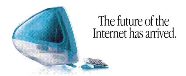
In 1998, they launched the iMac. And it wasn’t just another iMac, or just any computer. In that time, computers were all beige, bulky, and boring towers and monitors. Except for a few niche markets, like the sci-fi look of PCs by Alienware (now part of Dell) and the slick black boxy ThinkPad laptops by IBM (a line now owned by Lenovo), people didn’t associate computers with aesthetics. They thought PCs weren’t meant to have style and they never gave a thought about how their computer looked on the outside.

Apple changed that with their first colourful iMac in Bondi Blue. It was an all-in-one computer, with a monitor, speaker, logic board, storage, and ports all in one unit, with the accompanying keyboard and mouse. The casing had a handle and was made of a rounded blue-green translucent plastic casing. It looked like a bubble. While the front was in white plastic, with the Apple logo matching the dominant colour of the back.
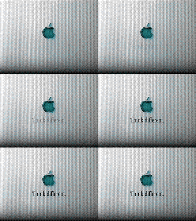
Their first ad campaign of the new iMac was narrated by Jeff Goldblum, echoing the feeling of boredom by the consumers when it came to the look of PCs in those days.


In the following years, Apple added more colours to the line, even patterns. The computers looked edible. I didn’t care much for Apple computers back then, but even I wanted one, especially when the Grape variant came out.

I wasn’t the only one. The colourful iMacs looked cool, and people wanted them. They made Apple look like the trendy outlier of the tech world. The refreshing style was an optimistic and welcoming view of tech—right before the dot-com bubble burst that made it feel somewhat disconnected. Other companies took note of how important colours were to people then, therefore the beginning of the colourful translucent plastic trend.

Long before you know it, manufacturers were making all sorts of things in all those beautiful colours. You had coloured floppy discs, rainbow USB sticks, mice, keyboards, video game consoles, telephones, pagers…

Soon it was getting out of hand: I saw tables, chairs, utensils… The fruity bubbly wasn’t just for tech products anymore. I thought it was overboard, but hey, if you wanted something colourful, it was the time!
Sadly, I never got an iMac. But I did get a few colourful things for my desk. I bought that nice translucent blue keyboard with extra media buttons and black keys that were useful in the time.

I also remember the colourful floppy discs I’d buy back then. I was so fond of those that I even tried to buy some in 2024—but wow, the rarity of those items is high, and so is the price. Sadly, while I found some coloured floppies, either they were not translucent, or the palette was not as fruity like the colours you’d find back then.

The trend also sparked a revolution in computer software. The colourful devices made people realise that we were tired of boring looks when using tech that was progressively getting more common in our lives. We wanted something new, fun, and inviting.
Apple moved on to replace their classic Mac OS with a brand new platform, Mac OS X. The operation system was adapted from NeXTSTEP, built on top of FreeBSD UNIX. Apple acquired it along with NeXT, the other computer company by Steve Jobs, in 1997.


The solid foundation of the new OS made it much more robust and stable. On top of that, Apple extended its new, colourful plastic style from its hardware with the introduction of a new interface design, Aqua. It made everything look like candy, with its round, translucent buttons and shiny surfaces. The look was like no other operating system out there back then, even Windows, with its common, bland, square, grey elements and straight lines. Microsoft didn’t take long to learn from Apple with its release of Windows XP and Vista later.
No one even thought it was possible to have a computer interface looking so complex and intricate yet so smooth and clean. That itself pushed software developers to take the same direction into making their plain interfaces look friendly and modern. The desire for fashionable hardware has made software go in vogue. Even Apple’s website sported the Aqua look for years and made me put in some of that plastic love onto my site.

Eventually, the movement of the bubbly, colourful products and fancy software interface gradually fell out of flavour and out of favour. Even if it was friendly and playful, the products were often made to look too bubbly or rounded, often more than they had to. Apps looked fancy, which was a nice walk away from the boring styles, but toning it down was better. Sometimes, when you can, doesn’t mean you should.
The style is only a memory of the late 90s and early 2000s now. While I thought it went over the top for a while, I miss its colourful nature and I wish products today would have more colourful variations, like the iPhone. (I sold my purple iPhone 14 Pro Max before getting a 16. I like my new one, but I miss the colour.) Who knows, fashion is always in a cycle. Apple introduced new colourful aluminium iMacs back recently in 2021.
Maybe colours will start a new revolution again someday?
Probably not in plastic, though…

I didn’t have my own camera in the late 90s, or a Mac, so I had to source my photos from different places, including Apple’s marketing material and archived site, as well as a few other web pages.
The title of this entry was inspired by the Japanese city pop song of the same title by Mariya Takeuchi, released in 1984.